Accessibility
Page Content
The University of Southern Mississippi has adopted the best practices and standards as defined by Section 508 of the U.S. Rehabilitation Act and level AA of the World Wide Web Consortium (W3C) per the Web Content Accessibility Guidelines (WCAG) 2.1. These guidelines explain how to make web content accessible for people with disabilities.
POUR
There are four main guiding principles of accessibility upon which WCAG has been built. These four principles are known by the acronym POUR for perceivable, operable, understandable and robust.
Accessibility Basics
Images
Images with text, like posters or infographics are inaccessible to unsighted visitors. By law everything that is available to sighted users must also be available to unsighted users. Therefore, any information that is displayed in an image must also be written out in the text on the page.
If the image is also a link, then the link destination should be described in the alt text.
Alt text (image description)
To make images accessible to people who are visually impaired, it’s important to always include “alt text.” Alt text is used by screen readers to explain what the image shows.
When writing alt text, you want to provide a concise but complete description of what is in the image. You can leave out phrases like “photo of” or “image of” because the alt text implies this already. Some screen readers cut off alt text after 125 characters, so it’s important to keep your description to that character count or less, if possible. We also suggest using a period at the end of alt text so that the screen reader pauses before continuing to the rest of the content.
Alt Text Example

Ok: Photo of cheerleader
Better: Cheerleader shouting in megaphone
Best: Southern Miss cheerleader shouting into megaphone at Friday night pep rally at Spirit Park
Links
Screen readers read out all the text verbatim, including URLs. To create a better user experience for those with screen readers, it’s important to use meaningful hyperlinks instead of spelling out URLs. You’ll also want to keep hyperlinked text to 100 characters or less to make sure they’re accessible to screen readers.
Screen readers also can read all the hyperlinks, allowing unsighted users to “scan” the web page. To make this feature useful to non-sighted readers, we suggest avoiding “here” and “click here” links as they don’t tell the user where the link goes. Creating meaningful hyperlinks helps sighted users as well because it allows them to quickly scan the page for important links.
Here are some examples for how to rewrite "here" and "click here" links:
Instead of “you can apply to USM by clicking here” try:
Instead of “to see a full description of services click here” try:
For more information about our services, check out the Complete Service Description (PDF).
Instead of “click here to register” try:
Register online through our system.
Tables
Our content management system applies the proper “markup” or coding to help make tables accessible to non-sighted readers. If you copy/paste a table into the CMS, you’ll want to make sure it’s coded properly so that non-sighted readers can access it. W3C has an excellent resource on creating accessible tables.
In addition to being coded properly, all tables must include a caption. The caption should be a short heading for the table content.
Videos
It is recommended that all videos used on the USM website be captioned and use an accessible video player like YouTube. If you’re using auto-generated closed captioning, be sure to review the captions for accuracy before adding the captioned video to your website. Auto-generated closed captioning is usually around 80% accurate. You must go in and edit the transcript.
Want to learn more about editing your YouTube video captions? Check out this Google Support article: "Edit or remove captions"
PDFs
Many PDFs aren’t accessible to screen readers at all, and even ones that are accessible can be difficult to use. We recommend limiting PDF use, but if a PDF is needed, they must be accessible.
Creating an accessible PDF starts at the document stage. We recommend using Word, PowerPoint, or Excel that has been made accessible then export to PDF format. When writing your document, you’ll want to use:
- Meaningful hyperlinks
- Alt text on your images
- Page breaks rather than tabbing to the next page
- Headings, following a consistent heading hierarchy or structure
- Simple tables
Once the document has been created be sure to save as a PDF and choose 'Best for electronic distribution and accessibility' if that is an option. Saving as a PDF allows screen readers to access the code in the original document. If you use print as a PDF instead, it will strip all this code away, making the content inaccessible to a screen reader.
For more information about making a PDF more accessible see Adobe’s “Make PDF’s Accessible" tutorial.
Headings
Section, page title, and heading tags tell non-sighted users how content is organized on a page. Therefore, it’s important to use tags appropriately for information hierarchy and in the proper order (H1, H2, H3, etc.). Please don't use headings to simply make the text more visually appealing.
For example, you wouldn't want to use a heading tag to highlight an application deadline. You also wouldn't want to use bold text in place of a heading tag because this would get skipped when a screen reader "scans" the headings and won't have the same orientation effect as a heading would.
Color Contrast
Text and icons, in order to be easy to read, must have sufficient contrast between foreground and background colors. The W3C Web Content Accessibility Guidelines (WCAG) defines specific contrast ratios that must be met for compliance. Where we usually see issues with color contrast is using a different background color than the standard white/gray on tables with text over it. Certain colors will not meet contrast requirements and therefore cause accessibility issues. There are tools in the below Tools and Resources section that will help identify colors that will work.
Tools and Resources
- axe
This accessibility testing toolkit from Deque (accessibility consultancy) is what our CMS will be moving to in the near future. It’s available as the axe Chrome Extension. - Siteimprove Accessibility Extensions
The Siteimprove Accessibility Extensions are free and can check any web page for accessibility issues at any given time. All analysis is done entirely within the browser, allowing secure evaluation of password-protected or non-public pages, multi-step forms, and dynamic content. - WAVE
Developed by WebAIM, this online tool evaluates the accessibility of a web page and shows results using icons and indicators, embedded onto the original page. It’s available as a standalone website, or as the WAVE browser extension for both Chrome and Firefox. - Functional Accessibility Evaluator (FAE)
This is an online web accessibility evaluator from the University of Illinois. FAE is capable of crawling a website and providing a summary report, plus reports for each individual page. - PageSpeed Insights - This is a tool by Google that will analyze your page for more than accessibility like how fast it loads and search engine optimization.
- Color Contrast Analyzer
This free application, available in Windows and Mac versions, makes it easy to check foreground & background color combinations. Both versions include an eyedropper tool for easily grabbing a particular color from anywhere on the screen. - WebAIM Color Contrast Checker
This handy online tool includes a feature to “lighten” or “darken” existing colors until you find a combination that meets WCAG 2.1 requirements. This functionality is also built into the WAVE Extension (see WAVE under “Third Party Accessibility Checkers & Browser Extensions”). - NVDA
NVDA (“Non-Visual Desktop Access”) is a free, open source screen reader for Windows. WebAIM publishes a handy guide on Using NVDA to Evaluate Web Accessibility. This is a great tool to get an idea of what a person using a screen reader hears when browsing your site.
Specific errors you may encounter while trying to publish a page
Header nesting issues
These errors usually refer to your header levels being out of order. Think of your headers as an outline for your page. If a person encounters that outline and parts of the outline are skipped, they assume something is missing or an error was made.
A level 1 header (H1) should be first. This is usually your page title and get automatically placed on the page when you fill out the page title field. Many people will start creating their page and use an H3 as the header immediately following that because they pick based on the size of the header. This may look better to you, but unfortunately doesn't meeting accessibility standards. You must use an H2 first in your page. Then an H3, and so on. So a proper structure may look like this:
Header 2
Header 3
Header 3
Header 2
Header 3
Header 4
Header 2
MORE ON HEADINGs AND PROPER STRUCTURE
Anchor contains no text
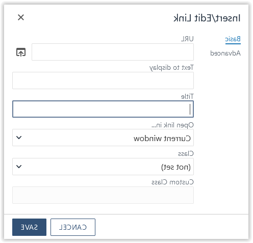
This error is normally triggered because you have linked an image to another page. This can be fixed by simply filling out the title field of your link in the WYSIWYG editor. Click on the image, then click the link button in the editor, and fill out the title field.
The other way that this error is caused is deleting text that used to the be a link and the editor left the link tags in the code. If you can use the error text to figure out where the empty link is, then just hit delete in the empty space in that area, you may be able to solve the issue. If not, you can fill out a support request and we will try to remove the empty link as soon as possible so you can get your page published.
b (bold) element used, i (italic) element used
This is typically caused by copy/pasting text from other applications. To fix this, just highlight the text that you have in bold or italics, click the relevant button off, then click it back on to bold/italicize your text again. The editor will then add the proper tags that are accessible.
id attribute is not unique
This error can be created by using the same jump menu links on your page. Each anchor jump link needs to be unique. But most often, this error is created by old code generated by previous software that is on your page. If you are getting this error and do not have jump links on your page, then please send a support ticket and we will clear the redundant id tag in the code.
Questions?
If you should have any questions or concerns about accessibility on USM’s website, please fill out a web support request or email webFREEMississippi.
Are you a visitor that is having trouble accessing our website?
Please read our web accessibility statement that has tools and resources to get help.